STRATEGIC VISION | SECURED MEMBER PORTAL
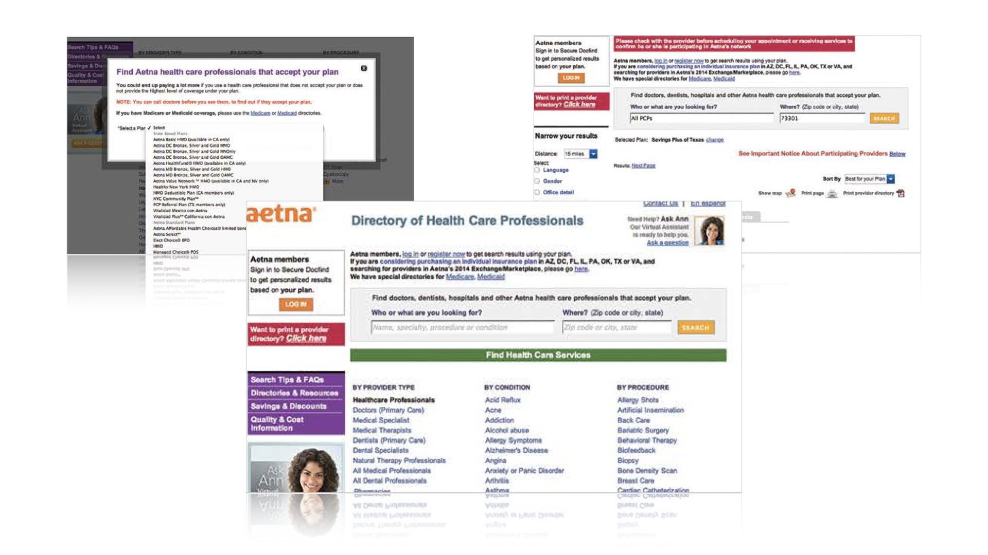
Aetna Navigator® was outdated, and perceived poorly by the members. Instead of relying on it, members went straight to the call center for resolutions.
︎︎︎
My Role:
I led a multi-disciplinary team of
UX/Visual Design/Content Strategist/Writer
Insight:
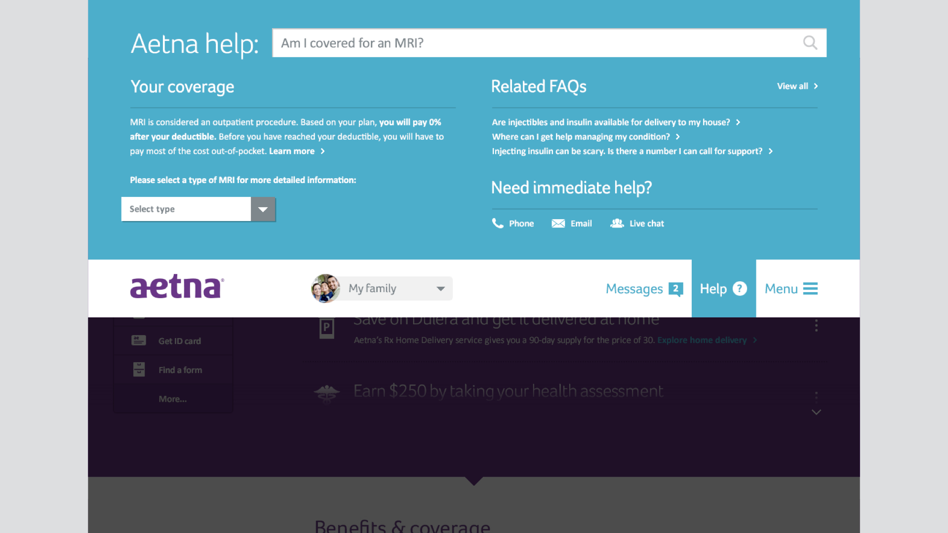
To reduce the reliance on the call center, we need to bring back the “digital-first” habit.
Our experience must help members complete top-of-mind tasks easily.
Northstar Recommendations
An easy-to-use and intuitive personalized dashboard that consolidates key tasks into a single view.
This reduces a typical (30+ clicks) 10-15 minutes to gather information into a single view.
Make claim info easily accessible. Then provide clear paths to resolutions through digital channel.
Claims-related questions are the #1 driver of member calls. Aetna spends roughly $50MM on claims-related calls per year (38% of calls).
Reduce the cumbersome 120 pages of benefits information into a personalized and easily digestible experience.
About 4MM calls annually (24% of call volume) were about benefits questions.
A 24/7 multi-tiered help center that provides personalized answers based on plan & healthy data.
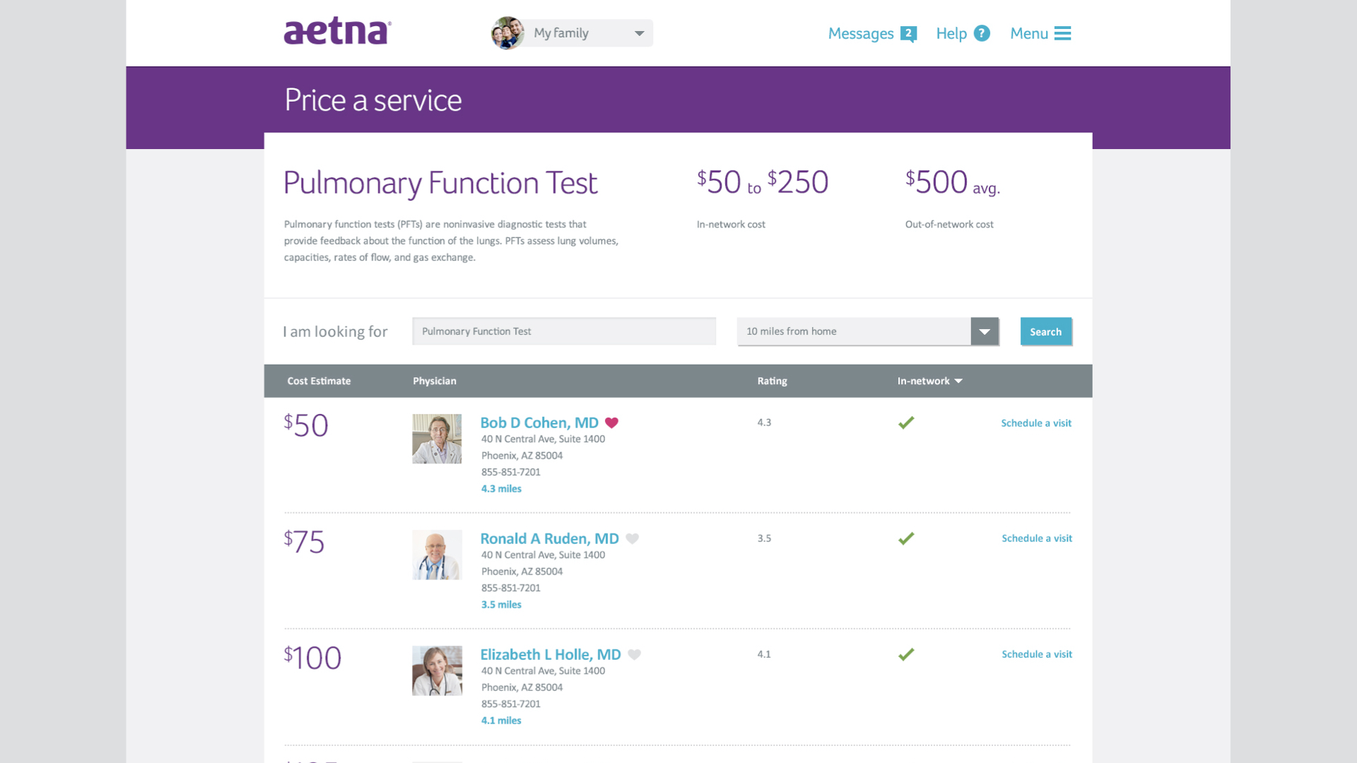
A “price per service” functionality to help the members make an informed and confident decision based on their plan.
Unexpected costs are a major pain point for members.
Results:
The northstar recommendation was well-received.
The concept was presented to the various internal stakeholders, including the CMO.
Our informed thinking made an impact on subsequent internal planning, spanning various LOBs and technical discussions.